Unify
Unify
Unify
User Experience. UI Design.
Design Systems. Prototyping.
User Experience. UI Design.
Design Systems. Prototyping.
Unify is a consumer communication tool built for IOS, Android, and Windows Desktop. The platform provides a variety of features include call, message, & faxing.
THE ASK
THE ASK
THE ASK
When I joined, Voxox was in the middle of a rebrand and seeking further investment. Leaders of the company tasked the creation of a mobile application that correlated with the current desktop app that included the new branding.
When I joined, Voxox was in the middle of a rebrand and seeking further investment. Leaders of the company tasked the creation of a mobile application that correlated with the current desktop app that included the new branding.
THE CHALLENGE
THE CHALLENGE
THE CHALLENGE
With no mobile application in place, we needed to a create a solution that could be applied to both platforms and scalable enough to extend to the existing desktop app.
With no mobile application in place, we needed to a create a solution that could be applied to both platforms and scalable enough to extend to the existing desktop app.
With no mobile application in place, we needed to a create a solution that could be applied to both platforms and scalable enough to extend to the existing desktop app.
With no mobile application in place, we needed to a create a solution that could be applied to both platforms and scalable enough to extend to the existing desktop app.
Navigation
Navigation
Navigation
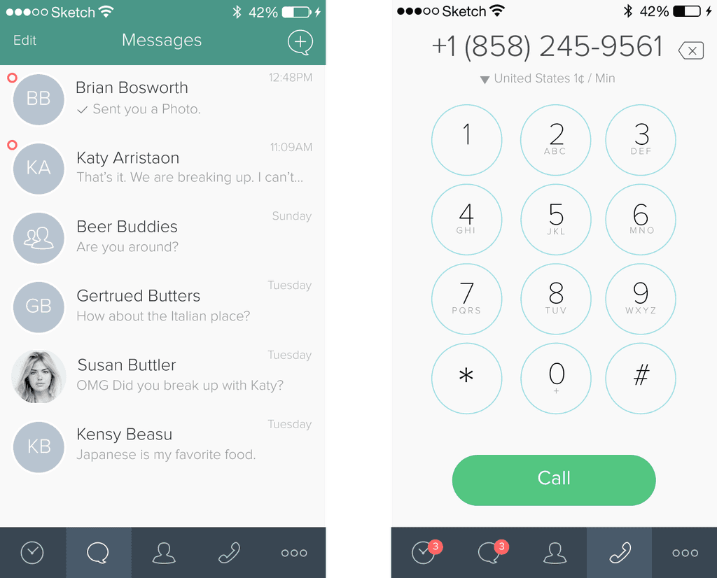
We design the experience around 5 tabs. Call History, Messaging, Contacts, Keypad, and More. The straight forward approach, let each tab have a focus directly on the functionality it provided. The inner pages of each tab would provide detail to it’s parent. Example, If you navigate to contacts, you’d see a list of your contacts. Selecting Contact, would take you to a detail page, where we provided relevant information of useful actions.
We design the experience around 5 tabs. Call History, Messaging, Contacts, Keypad, and More. The straight forward approach, let each tab have a focus directly on the functionality it provided. The inner pages of each tab would provide detail to it’s parent. Example, If you navigate to contacts, you’d see a list of your contacts. Selecting Contact, would take you to a detail page, where we provided relevant information of useful actions.


Contacts
Contacts
Contacts
The backbone of the entire experience. If you did not have access to your contacts, or their information, you’d have to rely on memories the phone numbers of the people you like to communicate with. We decided, when the user lands in the app, they were asked if they would like to import their existing contacts. This would take the burden off the user of manually entering this information.
The backbone of the entire experience. If you did not have access to your contacts, or their information, you’d have to rely on memories the phone numbers of the people you like to communicate with. We decided, when the user lands in the app, they were asked if they would like to import their existing contacts. This would take the burden off the user of manually entering this information.
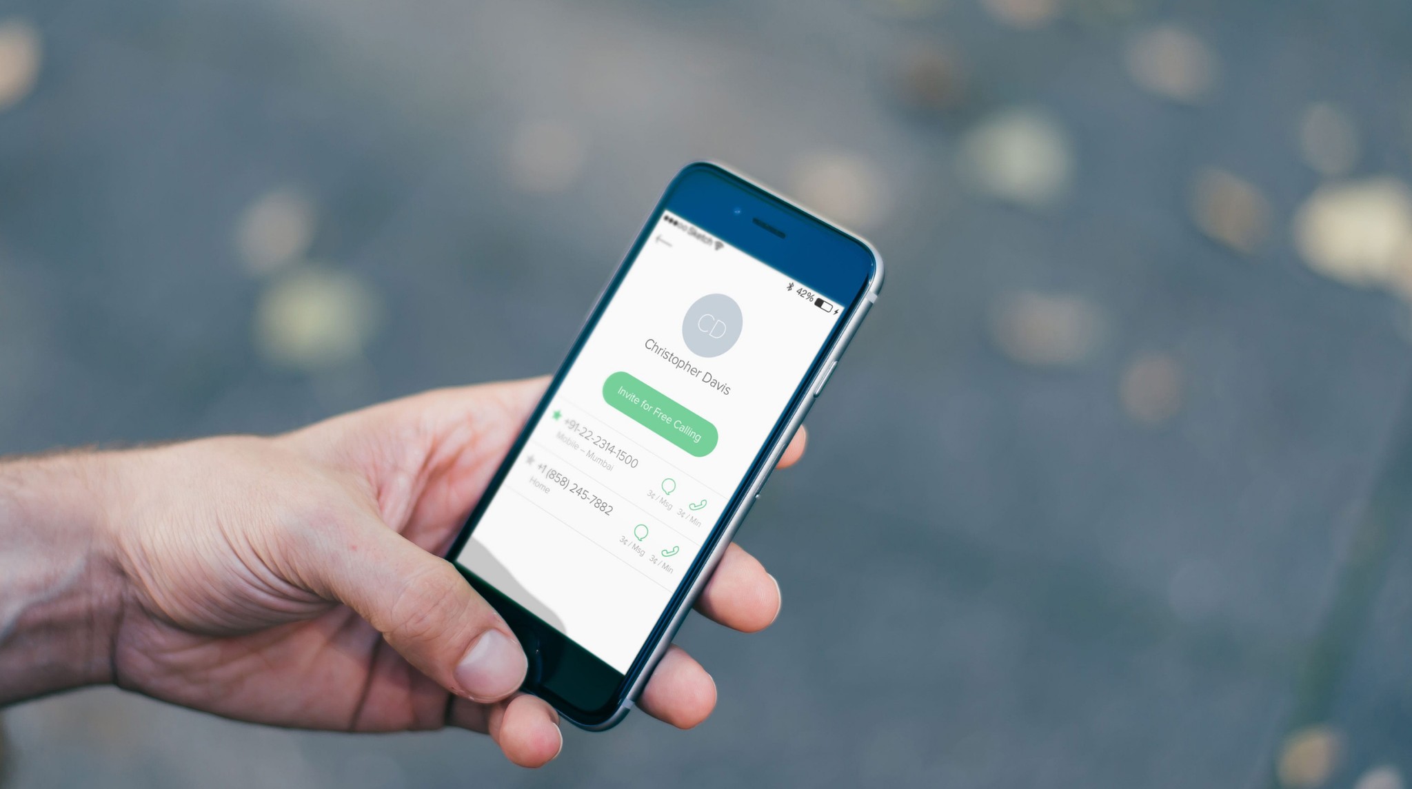
Once the contacts were in place, they could add, alter, or remove anyone they’d like, without damaging the devices contact list.
Once the contacts were in place, they could add, alter, or remove anyone they’d like, without damaging the devices contact list.


Calling
Calling
Calling
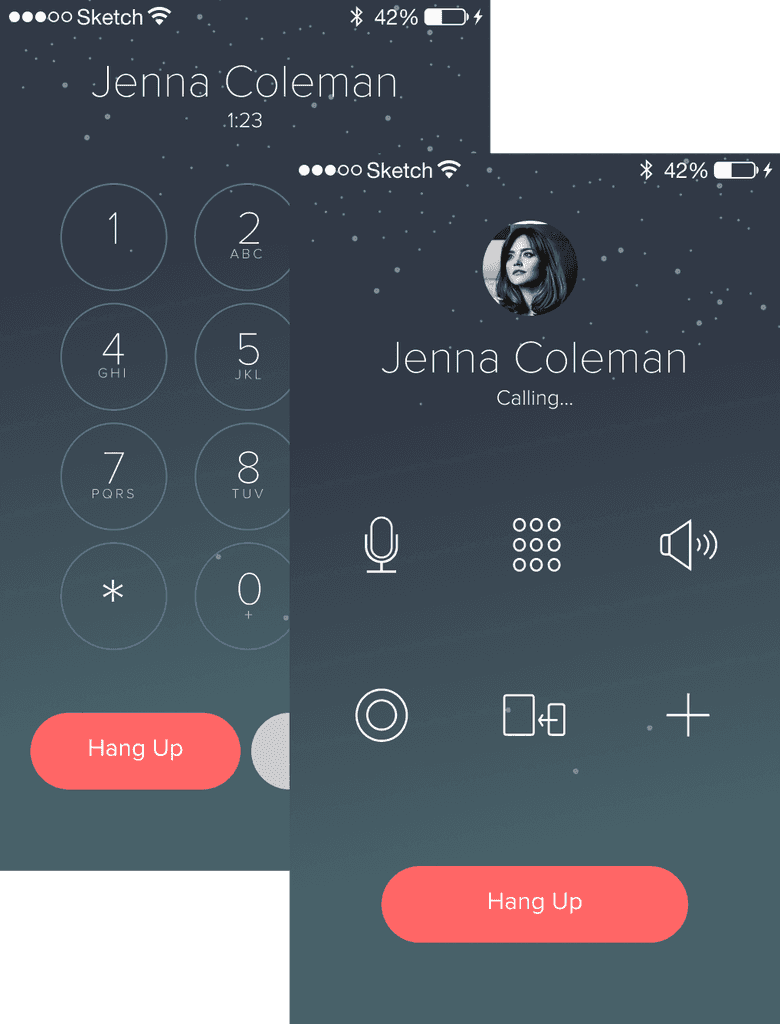
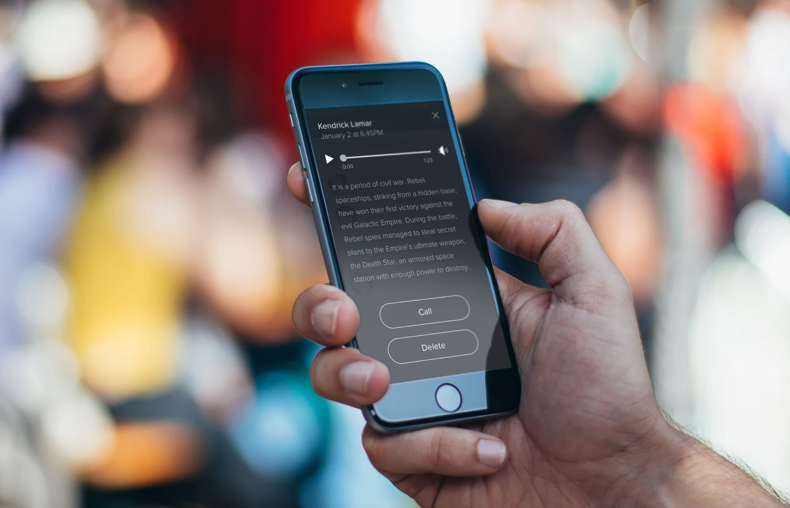
The call UI gave users the ability to mute, record, forward, conference, and access the keypad. If the user missed a call, or wanted to see a full list of all the incoming and outgoing calls, they could navigate to the Call History tab. Viewing the details of a missed call provided the meta details, and a voicemail transcript, if available.
The call UI gave users the ability to mute, record, forward, conference, and access the keypad. If the user missed a call, or wanted to see a full list of all the incoming and outgoing calls, they could navigate to the Call History tab. Viewing the details of a missed call provided the meta details, and a voicemail transcript, if available.

Message
Message
Message
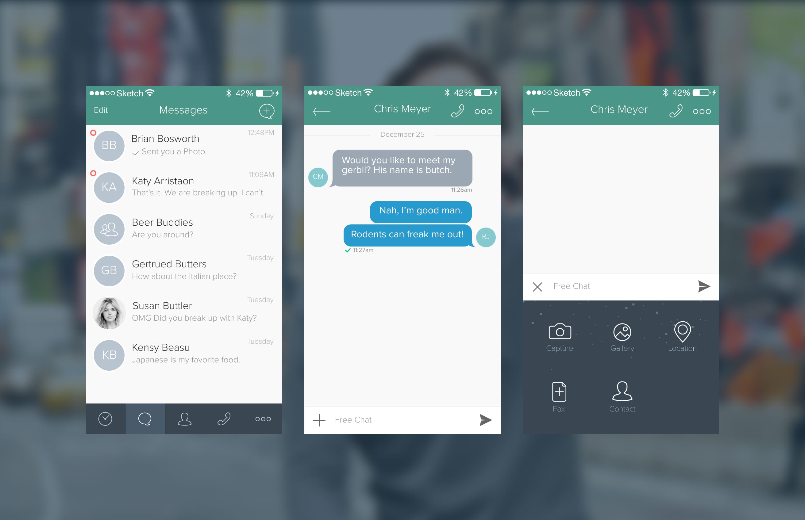
The message tab revealed a list of all the text conversations that the user had received or sent. Navigating into a conversation showed all the in and outbound messages between the contact and user. In the textfield where a message can be written, we provided a button that would reveal an interface where users could select stickers, photos, or fax the contact they’ve been messaging.
The message tab revealed a list of all the text conversations that the user had received or sent. Navigating into a conversation showed all the in and outbound messages between the contact and user. In the textfield where a message can be written, we provided a button that would reveal an interface where users could select stickers, photos, or fax the contact they’ve been messaging.


Takaways
Takaways
Takaways
Through the successful launch of Aspiration Zero, the team was able to deploy a scalable visual solution, acquire new customers, and provide additional value to the business. By building this product, the design had an opportunity to transition from Sketch to Figma.
Through the successful launch of Aspiration Zero, the team was able to deploy a scalable visual solution, acquire new customers, and provide additional value to the business. By building this product, the design had an opportunity to transition from Sketch to Figma.
This allowed us to design a new component library and deploy those components to the entire application: creating better documentation on how every aspect of the design should function.
This allowed us to design a new component library and deploy those components to the entire application: creating better documentation on how every aspect of the design should function.


PROJECTS
ABOUT
PROJECTS
ABOUT
PROJECTS
ABOUT
PROJECTS
ABOUT

